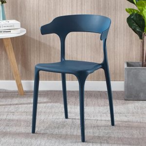
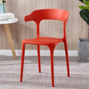
1. Monotone. Use a hue as the main color of the entire restaurant interior. Called monotone. A single tone can achieve a quiet and peaceful effect, and has a good sense of space and provides a good background for indoor furnishings.
In the monotone, special attention should be paid to changes in brightness and chroma to enhance contrast, and use different textures, patterns and furniture shapes to enrich the entire restaurant interior. Black and white achromatic colors can also be appropriately added to the monotone as a necessary adjustment.
2. Similar tones. Similar tones are the easiest color scheme to use, and it is also the most popular and popular color scheme at present. This scheme only uses two or three colors that are close to each other on the color circle. Such as yellow, orange, orange-red, blue, blue-violet, purple, etc., so it is very harmonious. image
3. Complementary tones. Complementary tones or contrasting tones are colors that use relative positions on the color wheel, such as cyan and orange, red and green, yellow and purple, one of which is the primary color and the other is the secondary color. Contrasting colors make the room vivid and bright, so that people can quickly get attention and arouse interest.
However, the use of contrasting colors must be cautious. One color should always dominate so that the other color maintains its original attractiveness.


